Wanderlust Travel
Branding Project
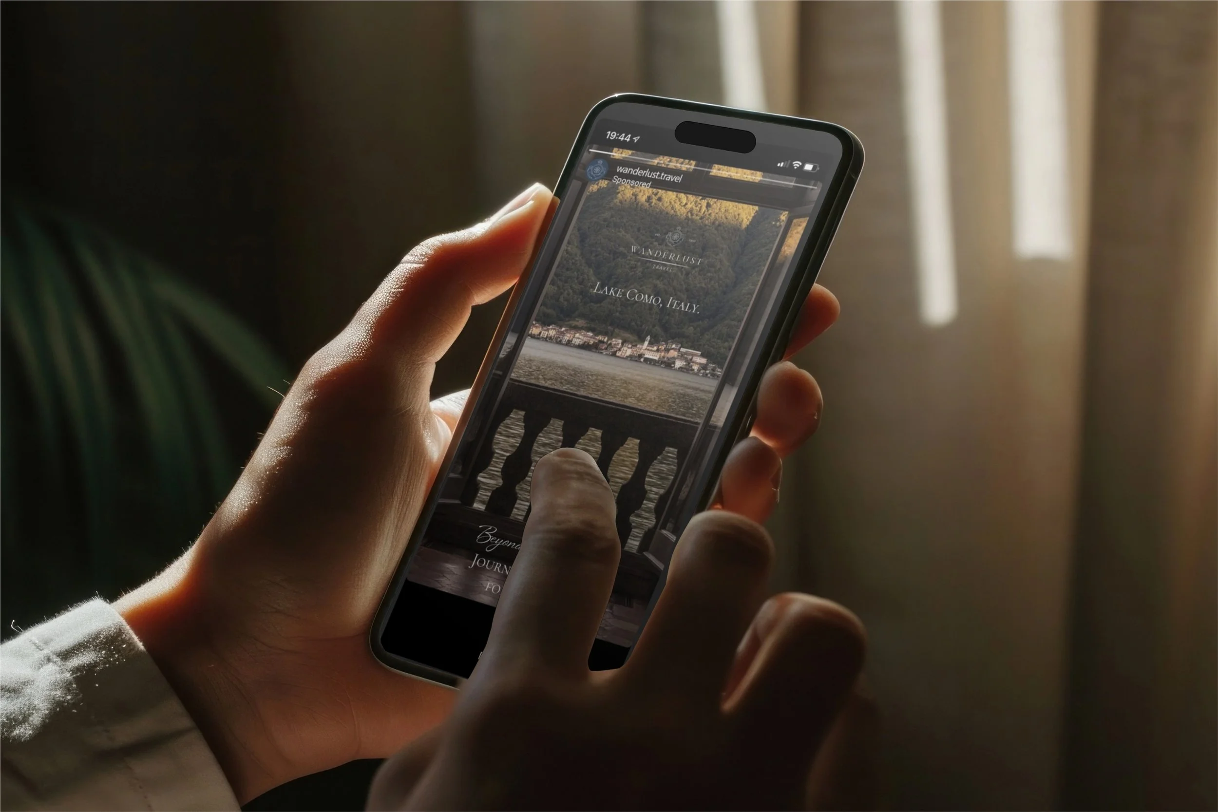
In this project, I need to create a competing and cohesive brand identity (primary logo, secondary logo, icon, color palette, and typography), social media templates for promotions, brochures, a postcard, three versions of stamps that represent Indonesia, Italy, and Maldives, for the well-established travel agency (1950), Wanderlust Travel, that reflects their premium travel offers. The branding will evoke a sense of luxury and exclusivity that appeals to young adults, couples, and individuals who need a luxury getaway that is reserved for the few.
-
• Developed a distinctive brand identity
• Created an engaging social media content
• Designed high quality prints
-
• Came up with designs that evoke luxury, exclusivity, and showcased their long-standing company.
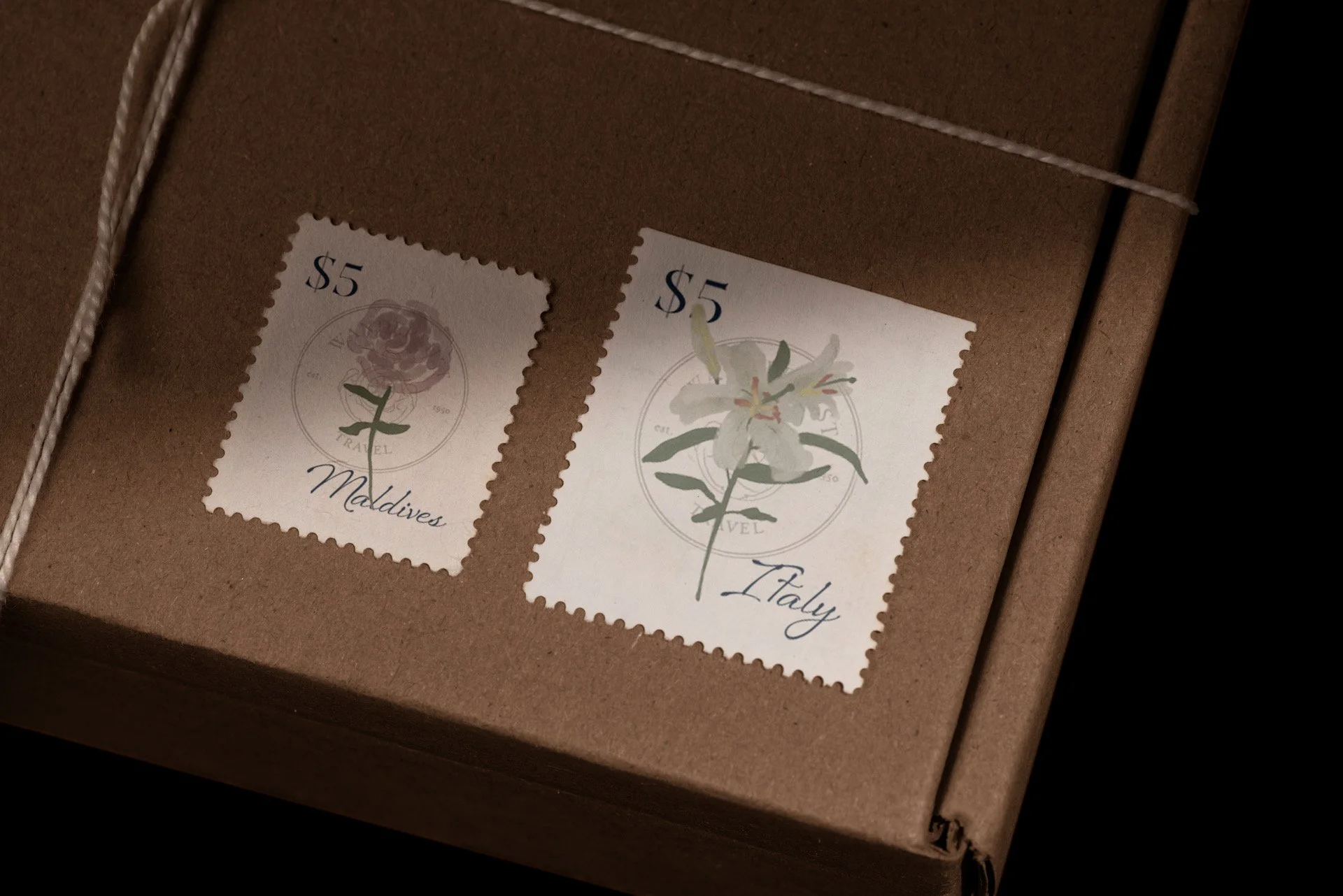
• One thing that represent each country as a whole and fit in a 0.87” H x .098” W stamp.
-
• To give off an upscale vibe, I need to create logos and designs that are dainty, well-structured, high contrast typefaces and some curves for elegance. I chose a muted neutral color palette.
• Used each country national flower for the stamps.
-
Adobe Illustrator, Adobe Photoshop, Adobe Fresco, Adobe InDesign.
Behind the Concept
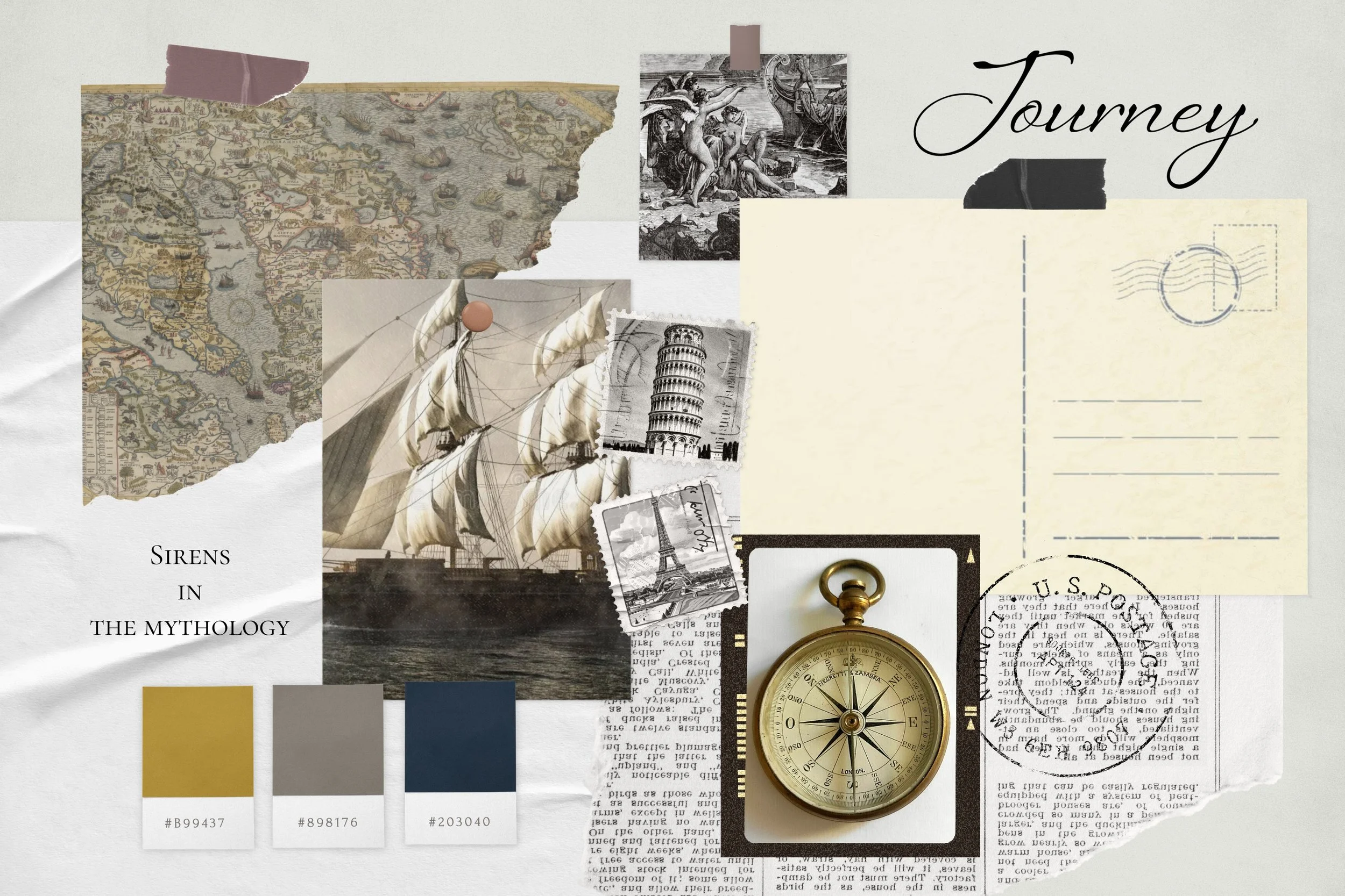
I conducted online research to gather design inspiration for a travel agency and noticed that many brands rely on familiar icons such as airplanes and globes to represent travel. I came across an article discussing the phrase “Here be Dragons,” a reference to medieval maps that used mythical creatures to mark unknown or uncharted territories. This concept inspired me to incorporate mythical elements—such as sirens, dragons or sea serpents—into the design to symbolize Wanderlust’s commitment to guiding clients into new destinations that can be experienced by the few.
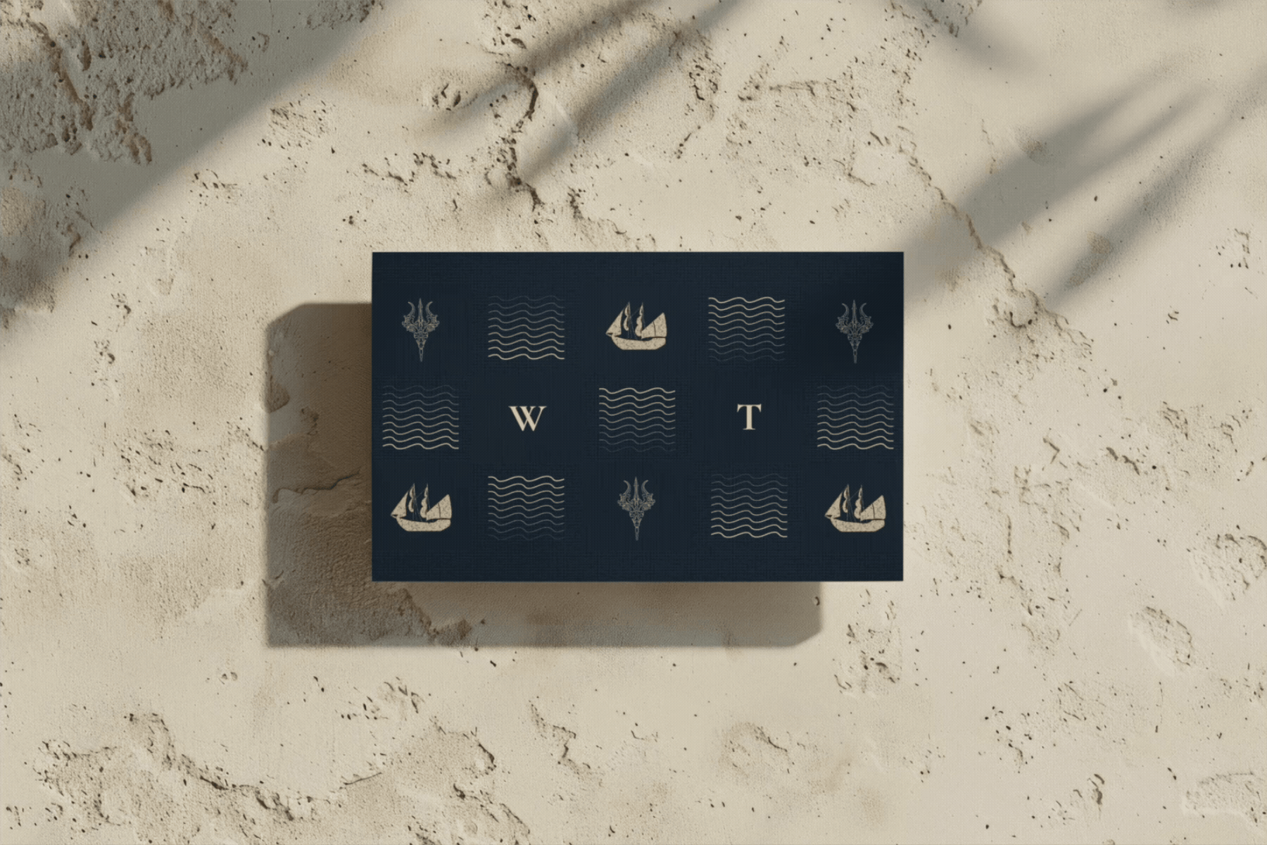
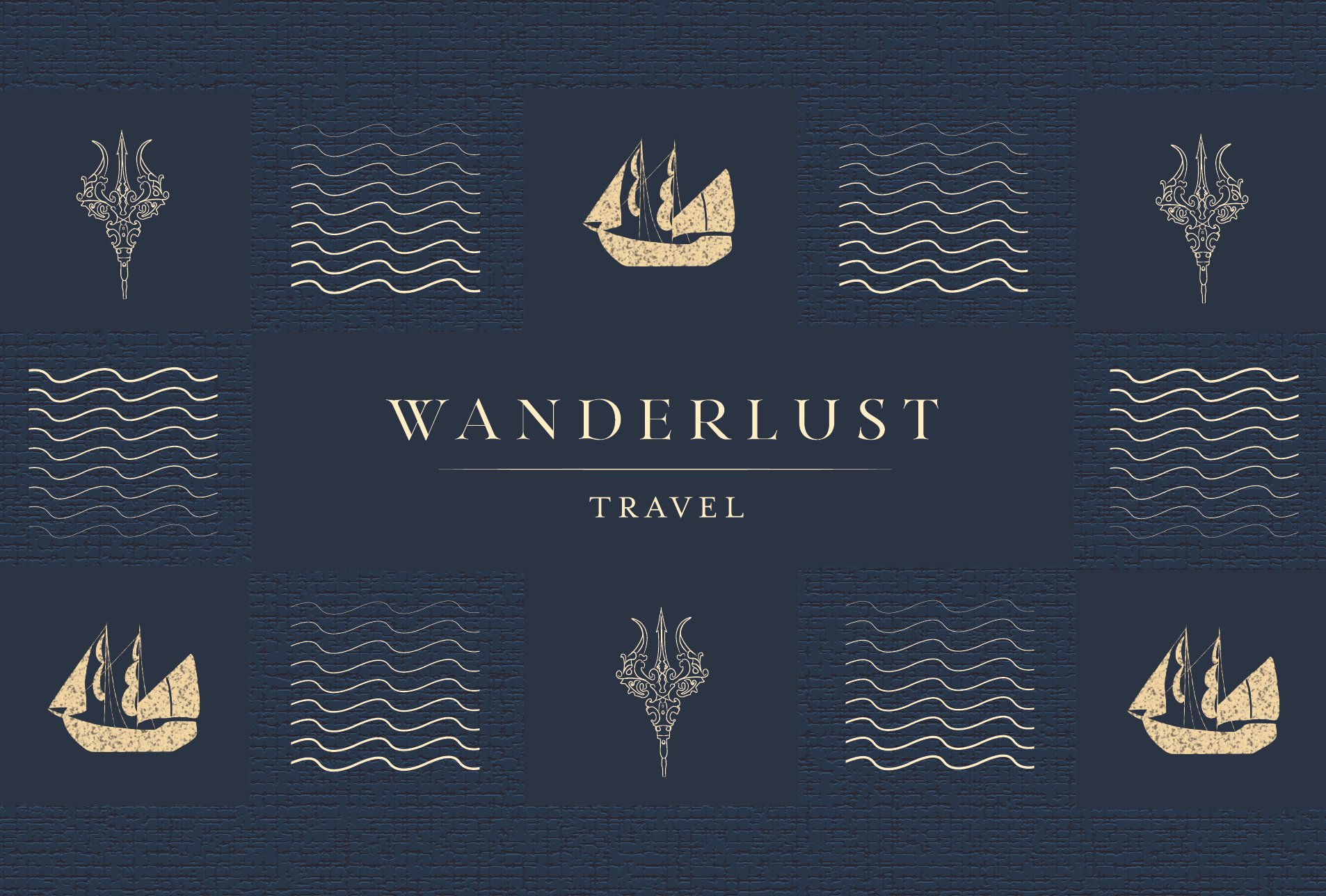
The Brand System
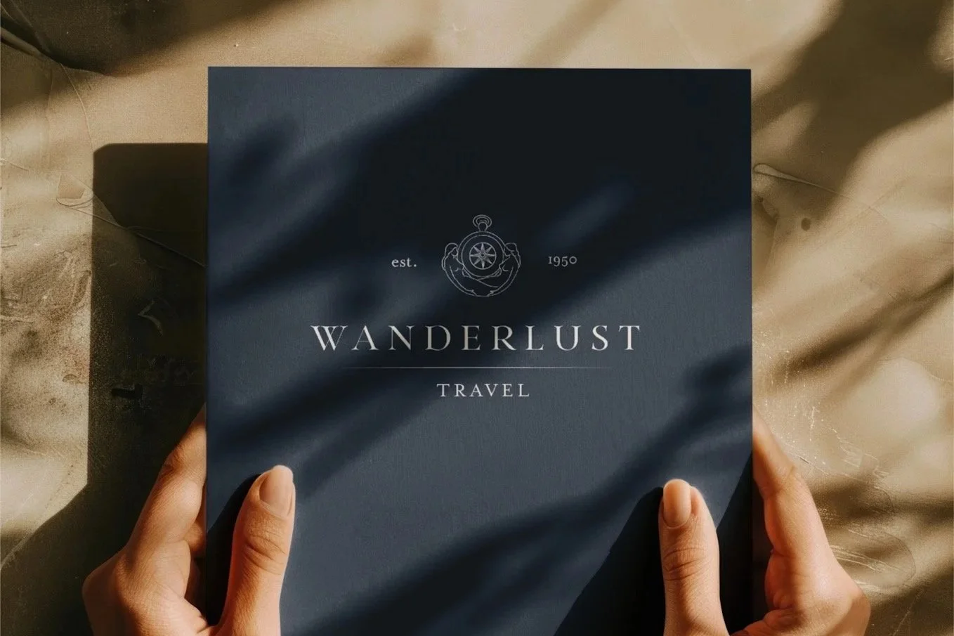
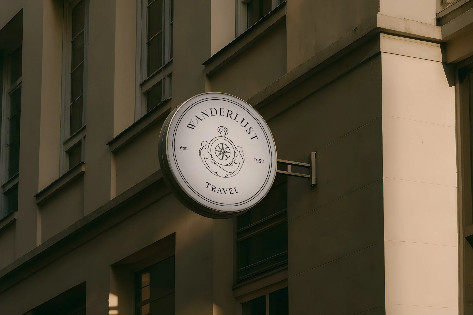
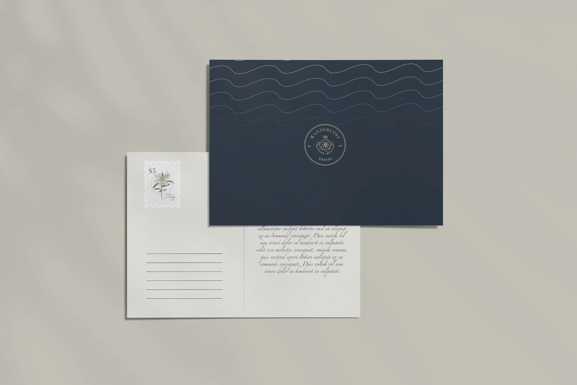
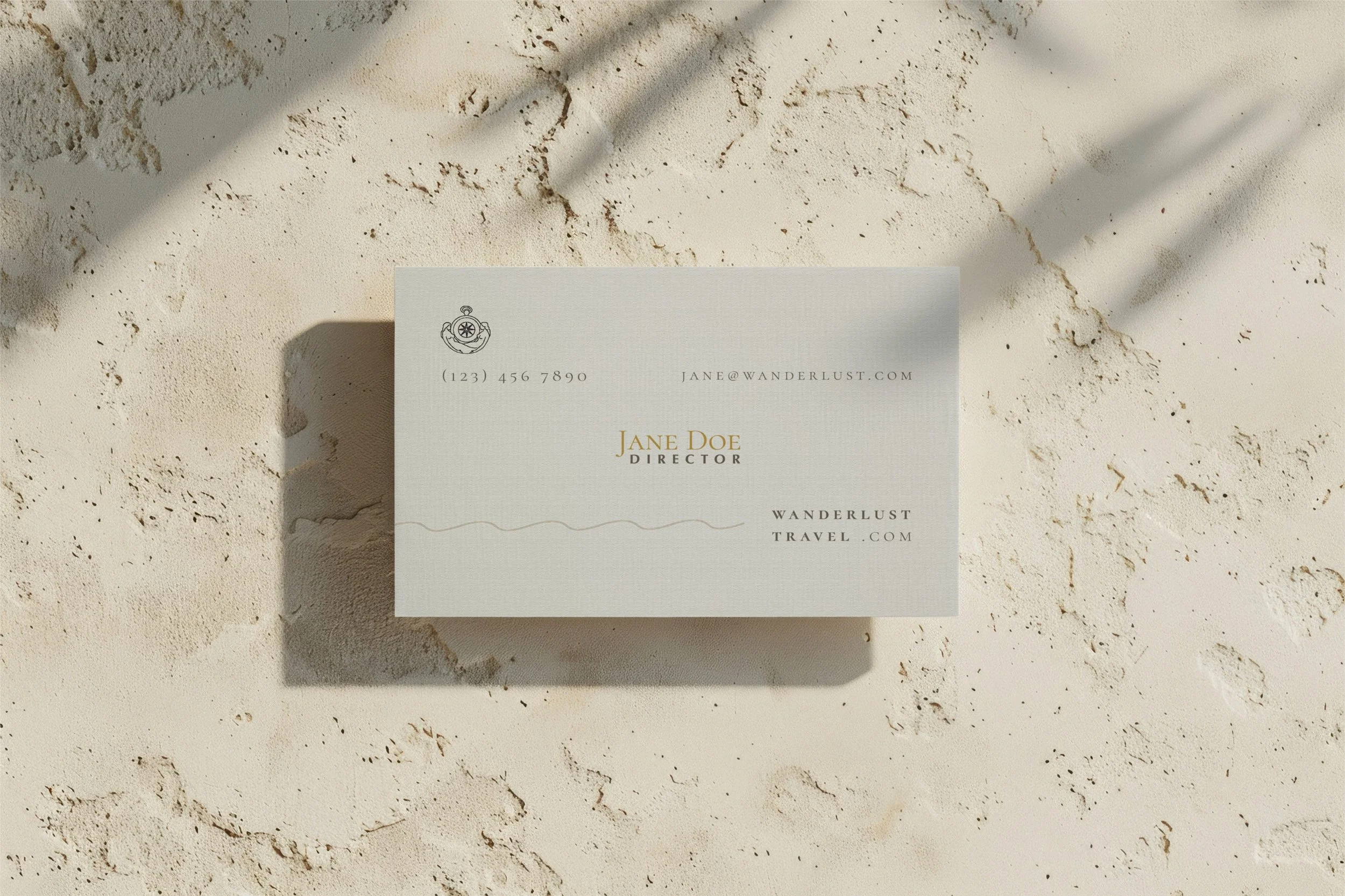
I decided to use a compass and two sirens as the foundation of the company’s logo, placing a siren on each side to create visual balance. I illustrated the elements in Adobe Fresco, focusing on clean, delicate line work to convey an elegant aesthetic. Drawing from mythology—where sirens are sea creatures known for luring sailors—I designed accompanying wave patterns and related icons, including a trident, a ship, and siren tails. For the brand’s color palette, I selected warm, neutral tones such as ivory, grey, gold, and navy blue.
For the typography, I selected Sheila, Cormorant, and Bodoni. The Sheila script adds an elegant touch, while Cormorant SC Book and Bodoni 72 Book provide a more structured and refined balance. Together, these typefaces create strong visual harmony, timeless and exude a sense of luxury.

The Design

Stamps design
I chose to represent each country with its national flower for the stamp designs. Using Adobe Fresco watercolor brushes, I illustrated the flowers to achieve a fluid, watercolor effect that aligns with and enhances the brand overall “water” concept.
White Jasmine for Indonesia
White Lily for Italy
Pink Rose for Maldives
Business card design


The Implementation